Affogato AI Revamp.
Turning a powerful but cluttered AI studio into one legible system — where people find the right tools fast, understand what’s happening, and stay in control of the work.
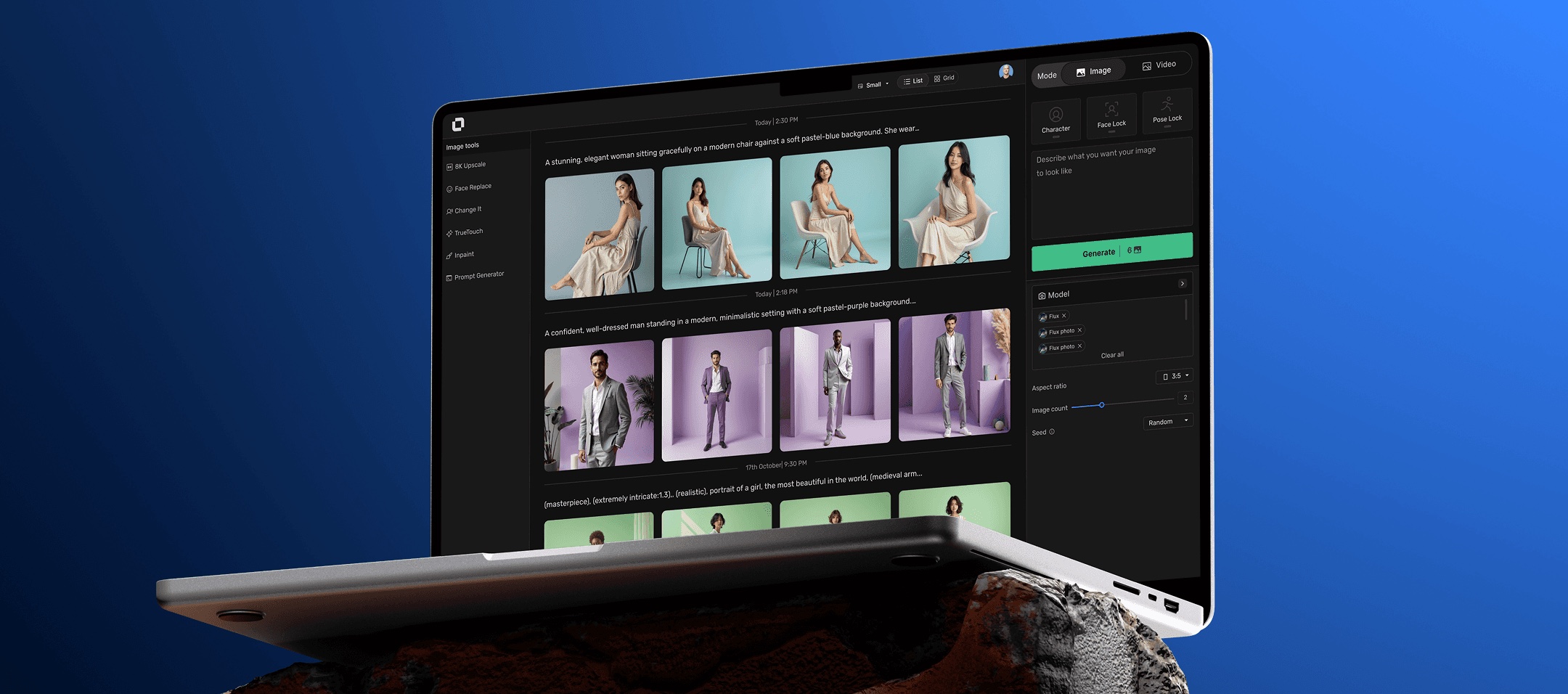
An AI-native studio, used by real creators.
What is Affogato AI?Affogato AI (previously RenderNet AI) is an AI image and video generation platform that specialises in creating consistent characters and lifelike visuals for creators and brands — producing ads, stories, and social content instantly.
What are Canvas & Studio?They are the two AI creative workspaces. Studio offers a linear, scroll-based interface for creating and previewing content. Canvas is a flexible, freeform space for experimenting with creative ideas.
A clearer, scalable foundation — and a reason to reach Canvas.
Studio and Canvas needed a clearer, scalable design foundation that improved overall usability and encouraged more users to adopt Canvas.
As the product evolves, users should be able to find key tools easily, understand system states, and receive clear feedback — the things that keep them confident and in control of their workflow.
Led design, close to engineering.
Yash Chavan
Harishiv Singh
Piyush Sharma
Prototype to think — grounded in behaviour, transcripts, and metrics.
User interviews, user feedback (emails and Intercom), Metabase event data, competitor analysis, and PostHog session recordings.
Paper sketches and Figma to explore directions quickly.
Figma prototypes and staging flows — the working interaction, not static frames.
Figma prototypes and staging links tested with participants to validate each direction.
Shipped and continuously improved the experience based on user behaviour and feedback.
What the research surfaced.
- 01 High cognitive load due to a cluttered interface
- 02 Narrow output area in Studio
- 03 Hard to locate ControlNet & FaceLock — essential for consistent characters
- 04 Insufficient feedback on which model is selected, especially in Studio
- 05 Users are unclear how many outputs will be generated
- 06 Inconsistent UI across sub-apps
- 07 Low-value features clutter the experience and remain unused
- 08 Difficult to navigate through generated outputs
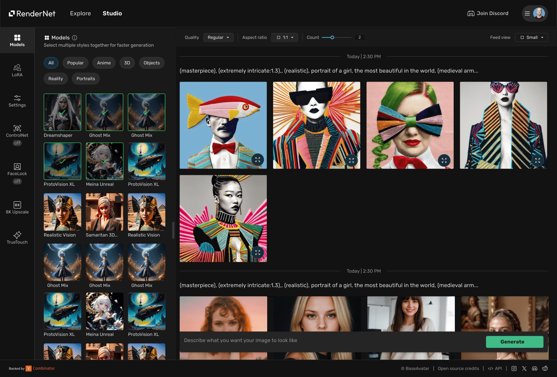
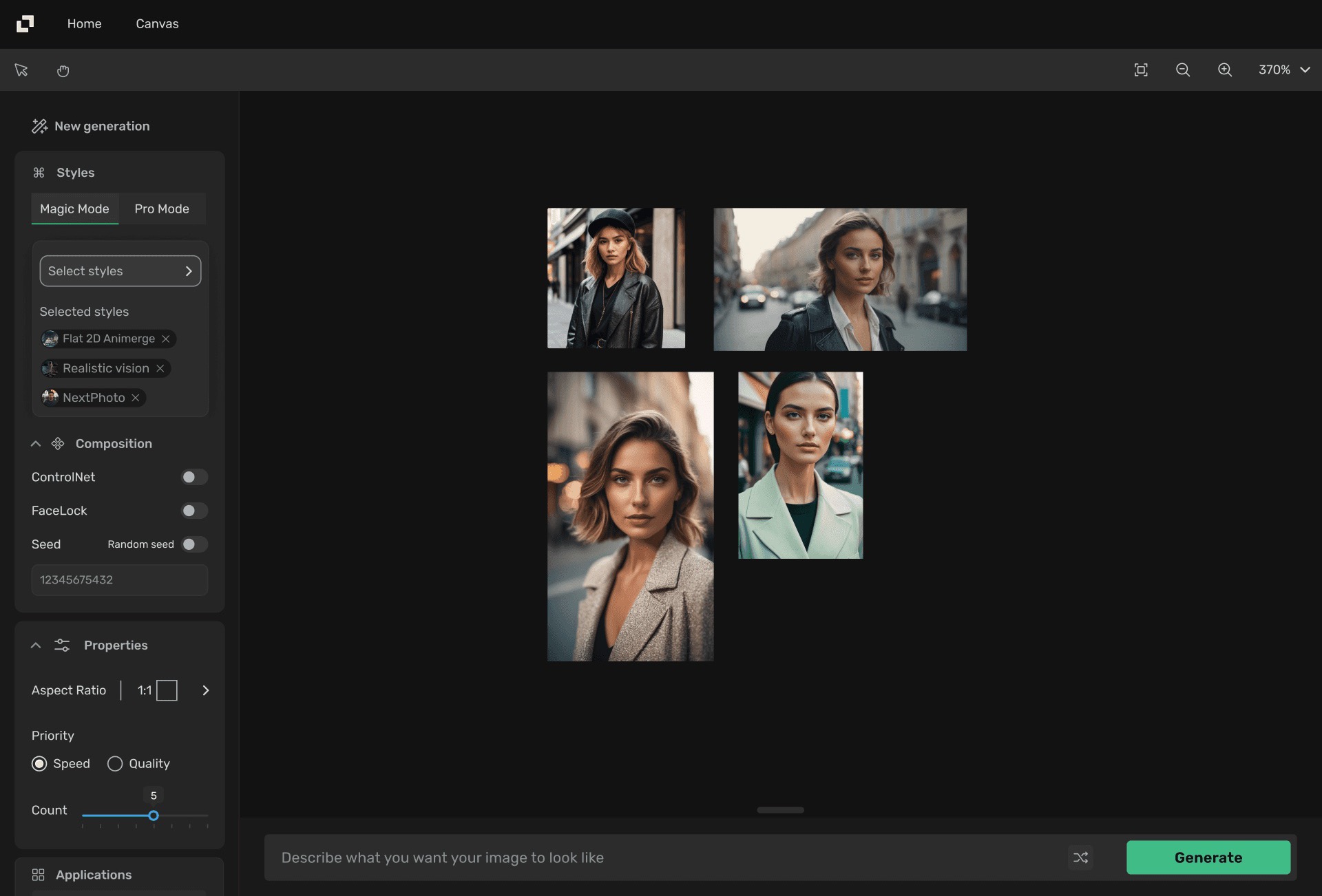
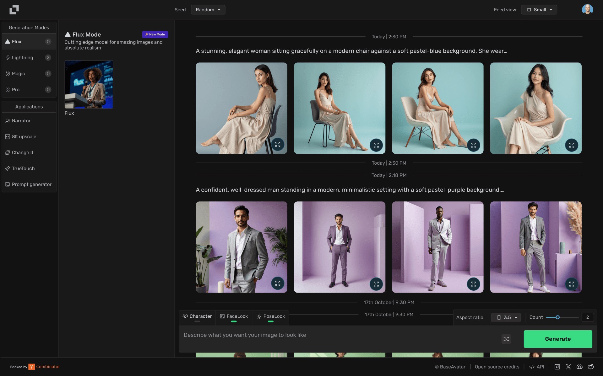
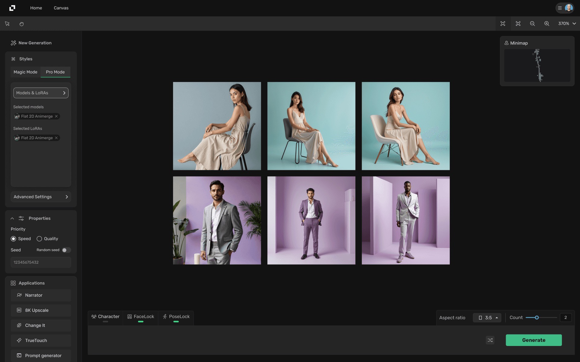
The starting point — Studio and Canvas before the redesign.
Rebuilt in three deliberate phases.
Cut the friction users hit first.
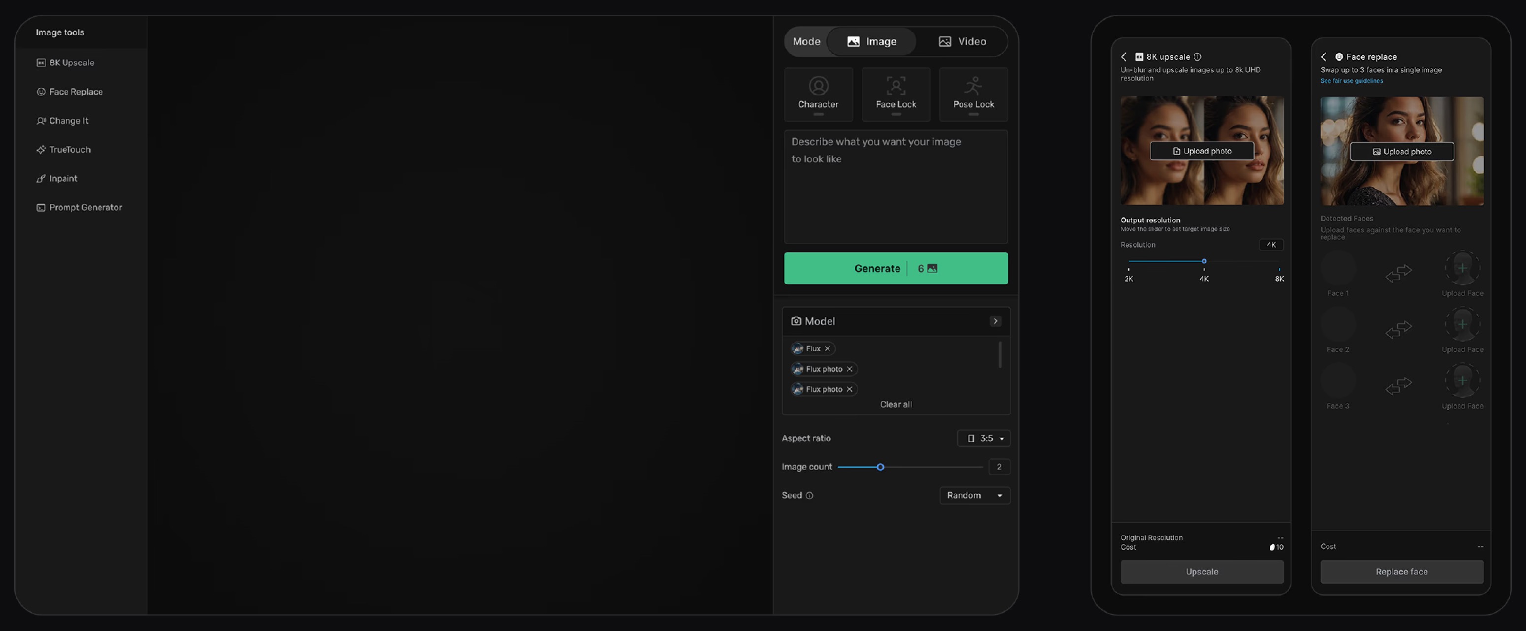
- Improved the left-menu layout in Studio for better readability
- Relocated frequently used controls — Face Lock, Pose Lock, aspect ratio, batch count — next to the prompt box for faster workflows
- Introduced a minimap for smoother, faster canvas navigation
Turn two surfaces into one legible system.
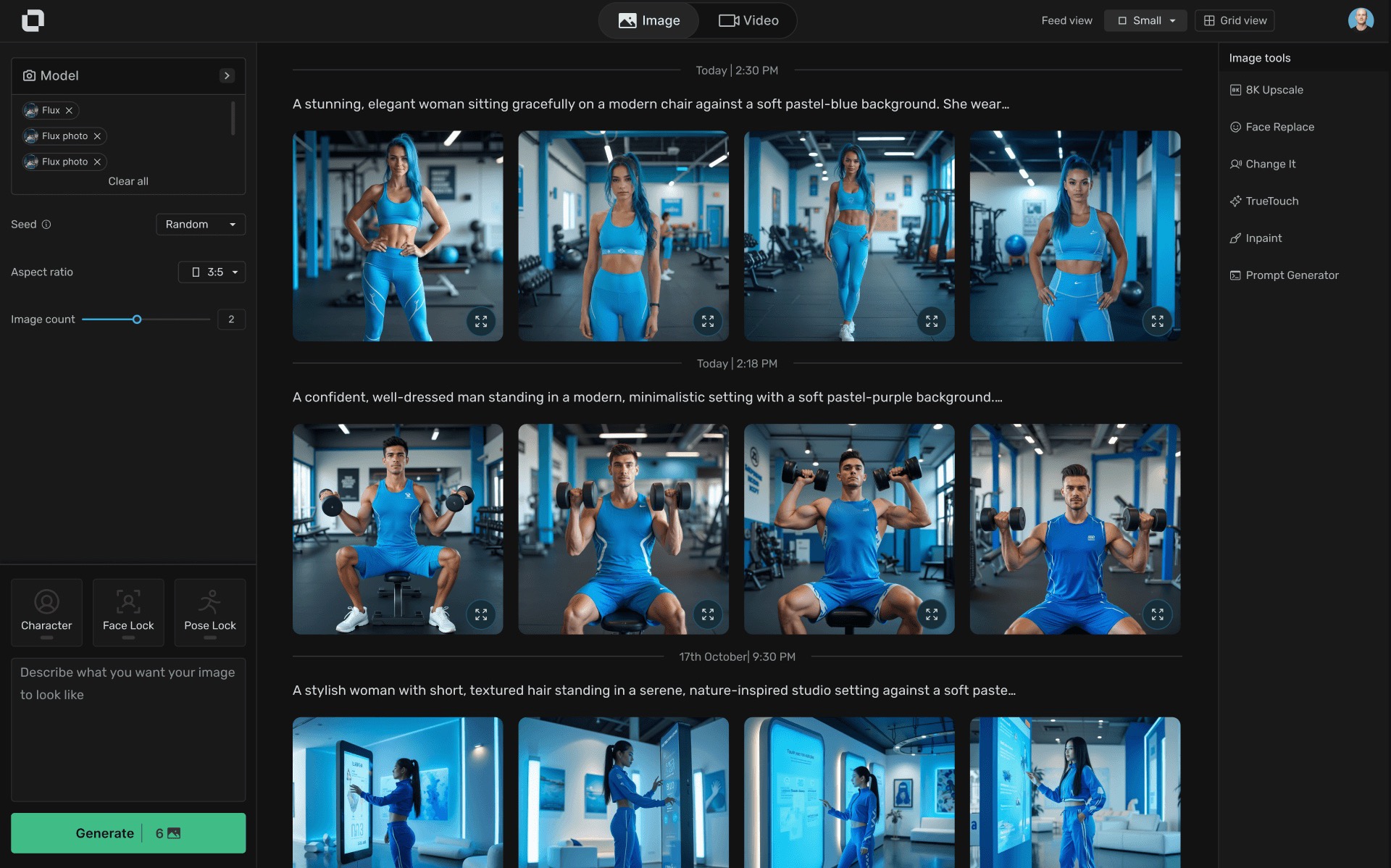
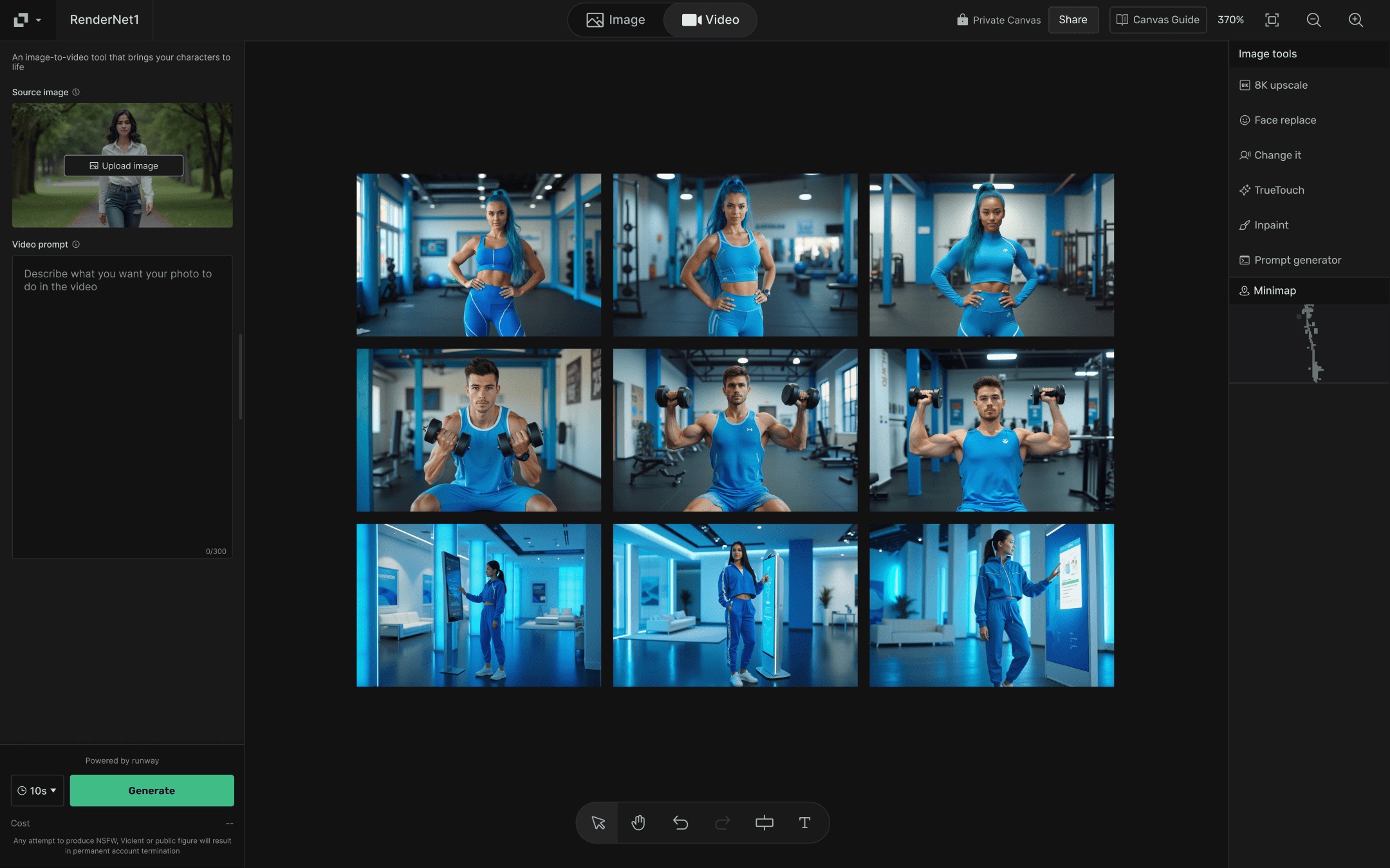
- Unified Studio & Canvas under one UI — easier to build, and a smoother move to Canvas
- Grouped essential generation features on one side, sub-apps on the other
- Split image and video into distinct modes for clearer control
- Removed low-value features and settings to reduce complexity
- Surfaced the output count directly on the Generate button
- Displayed model names clearly for instant recognition
- Added a grid view to Studio for easier media browsing
- Introduced key canvas controls to improve navigation
Tune the ergonomics of generating.
- Moved the main generation area to the right for better ergonomics
- Placed Mode alongside the generation menu so it’s easy to find
- Made sub-apps consistent across the product